
eCommerce Web Design: Anatomy Of A High-Converting eCommerce Store
Neither is it your shipping policy (or whether you offer free shipping).
The one factor that can make or break an eCommerce store is… the store’s eCommerce web design.
In this blog post, we’ll discuss exactly why eCommerce web design is so important, and walk you through the anatomy of a high-converting eCommerce store.
Ready? Let’s get started!
The importance of eCommerce web design
Think of your eCommerce store as a funnel. To get more traffic (or more people into the funnel), you can do various things, including:
- Running paid ads
- Promote your brand on social media
- Partnering with other stores to create a campaign, etc.
Now, here’s the important part…
If your website doesn’t convert effectively, this means that the vast majority of the traffic you generate will “leak” out of your funnel, and go to waste.
That’s where eCommerce web design comes in.
Now, when you’re designing your store, you’re not just aiming to create a website that’s beautiful and aesthetically appealing. More importantly, your store has to function well, and be optimized for maximum conversions.
Wondering what counts as a “good” conversion rate?
Well, as of Q2 2018, statistics show that the average eCommerce website conversion rate (for UK sites) is 4.31%, so aim for something that’s higher than that.
Want to learn how to use eCommerce web design to boost conversions, and get more paying customers? Read on to find out more!The anatomy of a high-converting eCommerce store
When it comes to eCommerce web design, form and function are equally important. In this section, we walk you through what a high-converting eCommerce website looks like.
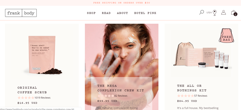
#1: Homepage
Your homepage is where you first make contact with your customers, so make sure that you’ve got a beautifully-designed page that looks professional.
Elements to include:
- Product section
- Phone number / address
- Email list sign up
- Live chat
To make your product section more dynamic, consider setting up your site such that it displays an alternative product image when a customer hovers their mouse over a product:
Some eCommerce stores like to use a similar product image (for instance, a shot of the product from another angle) here… but consider switching things up and using a “lifestyle” shot instead.
This showcases your product in action, and helps customers relate to your brand.
Next, make sure that you display your company address and phone number at the footer of your homepage.
Yes, we know that pretty much everyone emails (instead of calling) these days, but showcasing your number and address will give your customers peace of mind that you’re a legitimate business, instead of a fly by night operation.
Next, you’ll also want to have an email list sign up on your homepage.
Why is this important? Well, if a customer joins your list, and you see that they’ve exited your website without checking out their cart, you can hit them up with a cart abandonment email and prompt them to complete their purchase.
The average eCommerce cart abandonment rate is a whopping 69%, so being able to reach out to your shoppers via email (and convince them to revisit your site) will definitely be a huge asset.
Pro-tip: to grow your email list more quickly, offer an incentive for signing up. This could be anything along the lines of:
- % discount off the next order
- Fixed amount off the next order
- Free gift with purchase
- Free shipping
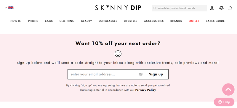
Finally, include live chat on your website as well:
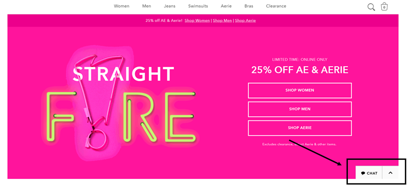
Statistics show that that website visitors that engage with your company via live chat are worth 4.5 times more than visitors that don’t, so live chat is definitely a crucial part of eCommerce web design.
Optional:
- Location selector
- Customer testimonials
- Media mentions
- Shoppable instagram feed
If you’re serving customers in different regions, consider getting your customers to select their location via a form when they first land on your site.
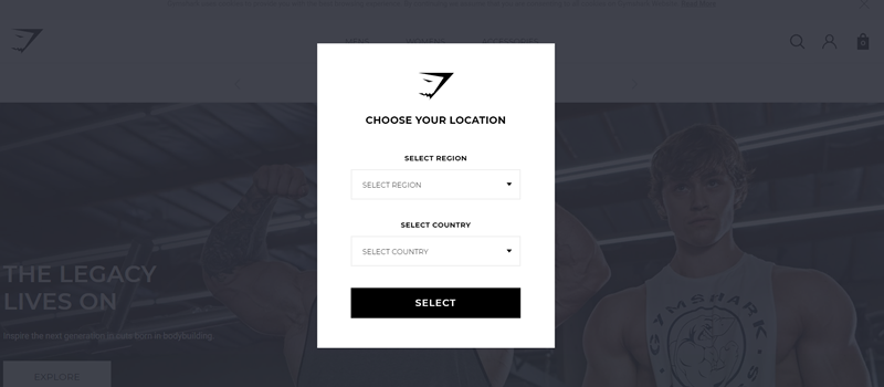
From here, you can either redirect them to a specific site for shoppers in their region, or switch over to displaying prices in their local currency.
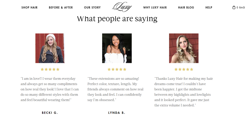
Next, if you’ve only got one or a few SKUs in your product line, then you might want to add a testimonials section to your website:
If you’re selling a huge range of products that are largely unrelated, though, then it makes more sense to feature reviews within individual product pages.
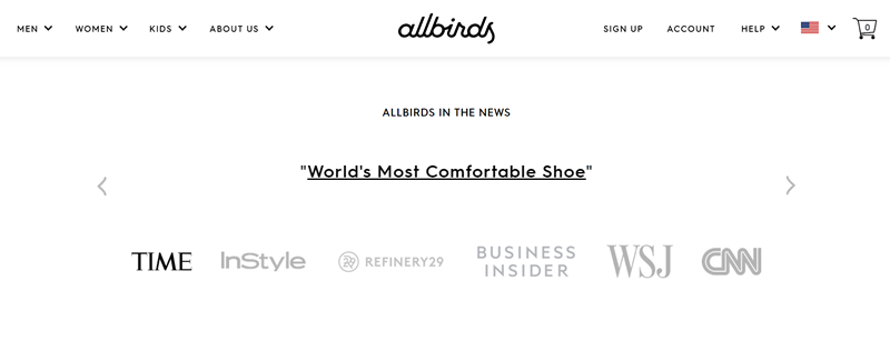
Moving on, if your product or company has been heavily featured in the media, you can milk this with a media section on your homepage:
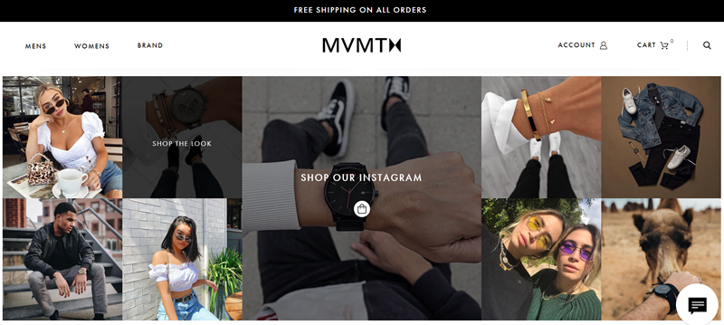
Finally, if you’re selling lifestyle-related products, and social media is a huge part of your strategy, consider adding a shoppable Instagram feed to your homepage as well:
Alright, that’s all we’ve got for you when it comes to eCommerce web design for homepages. Let’s move on to talking about your About Us page!
#2: About Us Page
Mention the phrase “eCommerce web design”, and most folks automatically think of homepages and product pages. But what these folks don’t realize is that your About Us page is important to get right as well.
Why do we say so? Well, 86% of consumers state that authenticity is important when deciding what brands they like and support.
Bearing this in mind, you’ll want to flesh out your About Us page and make sure that it reflects your brand well.
Elements to include:
- Brand story
- Team picture
On your About Us page, talk about your brand story, how you got started running your business, and how far you’ve come since then.
You can also discuss what you want to achieve with your brand, what your brand stands for, and showcase the people behind your brand.
Need some inspiration? Here’s a Shopify guide that features some great About Us page examples.
#3: Product Pages
Want to take your product pages from bland and boring to exciting and high-converting?
At the basic level, you’ll obviously have to nail your product images and copy. That aside, be sure to also include these following elements:
- Customer reviews
- Countdown timer
- Additional information (eg sizing charts)
- Social pop-ups
- Product recommendations
First up, a quick and easy way of adding more social proof to your site is by relying on customer reviews. If you haven’t already done so, come up with a strategy to collect more reviews, and make sure that you’ve got reviews on all your product pages.
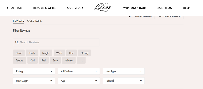
Pro-tip: to help your customers sift through all the reviews and hone in on the ones that are the most relevant to them, consider setting up a specialized review search function:
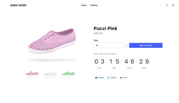
Next, using a countdown timer on your eCommerce store can help you to increase urgency, and boost conversions.
These are typically used in conjunction with special sales and promotions:
On top of that, provide your customers with sizing charts, product care guides, and any other useful information that will sway them towards making a purchase.
Say you’re an eCommerce store selling t-shirts, for example.
On top of providing the standard measurements for your different shirt sizes, you can also come up with a nifty chart or image that shows the fit of your different t-shirts on an average-sized model:
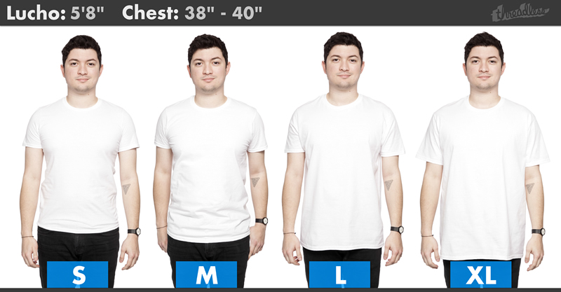
By providing your customers with additional information, you’re reducing the friction associated with a purchase, which will help with your conversion rates.
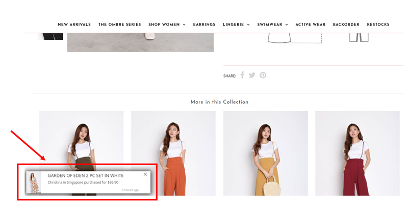
Moving on, we also recommend using social pop-ups to drive more social proof. You can use these pop-ups to notify a customer that a certain item has just been purchased:
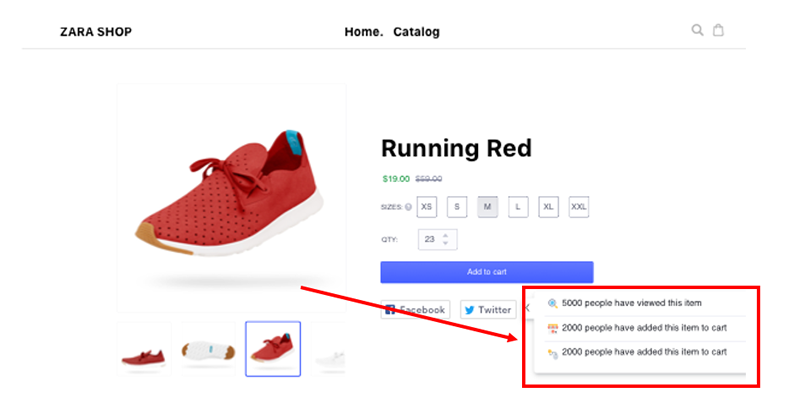
Or to showcase the total number of people who have viewed a certain product, or added it to their cart:
Finally, adding a product recommendations section in your product pages is a great way to cross-sell customers.
Here’s how this might look like:
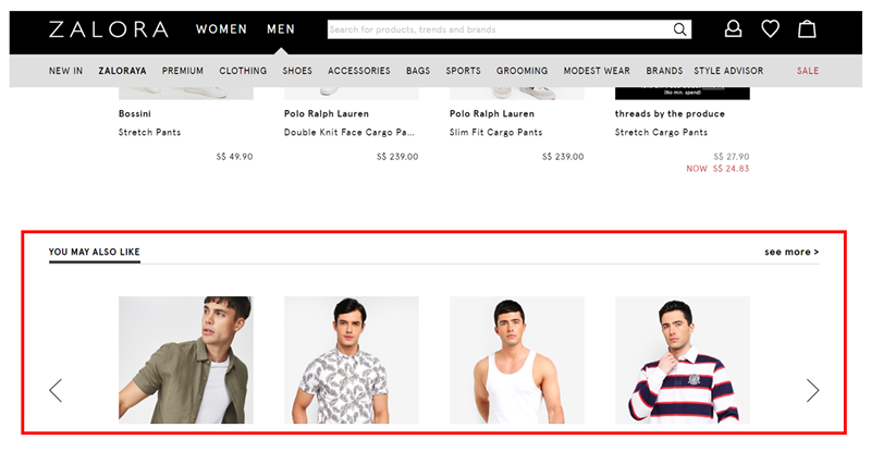
Again, this helps to boost conversion rates; it also works to increase your Average Order Value (AOV).
#4: Checkout Page
Last but not least, your checkout page should be fuss-free and intuitive to use.
The more complex your page is and the more steps it involves, the higher your cart abandonment rate… keep that in mind!
Elements to include:
- Login and guest checkout
- Billing and shipping fields
- Security badges and trust signals
First up, allow your customers to decide whether they want to login, create an account, or check out as a guest.
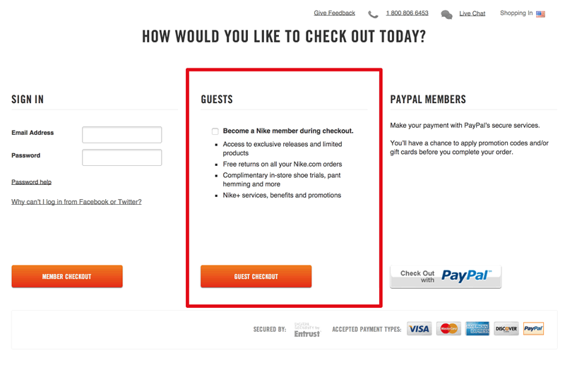
Some folks might not be comfortable with providing you with their personal information — and if you don’t offer a guest checkout option, you can bet that those sales are going down the drain.
Next, don’t make your customers fill out their address twice (once in the Billing section, and again in the Shipping section).
Instead, auto-populate the Shipping section with the information that your customer has already filled in, or allow them to check a box to copy over their information accordingly.
Finally, add security badges and trust signals to your checkout page — these increase the legitimacy of your site, and help to boost conversion rates.
—
Want to build your very own high-converting eCommerce store? Click here to learn more about our Shopify services!